
Why I built it?
Some tedious design work had always bothered me, and it often came up in conversations with other designers too. We all seemed to complain about the same things.
Pain Points
Building a colour palette takes ages
A UI colour palette is different from a branding palette. Branding colours can vary widely in brightness and saturation, with combinations often chosen to express creativity and personality. For UI, however, colours need to work as a system. They should feel like they belong to the same family, with a similar visual weight, so they can sit alongside each other in UI elements, charts, buttons, and data visualisations without one colour feeling overly vivid while another fades into the background.
Now imagine building a palette of 10 colours, each with 10 brightness steps. The colours need to feel harmonious horizontally, while each step maintains a consistent perceived brightness vertically across all 10 colours. And that’s just for one mode. If the product supports both light and dark modes, that means building and balancing two palettes.
Font styles and settings aren't exactly exciting
There are thousands of fonts on Google Fonts. Which ones come with a useful range of weights? Which ones pair well together? Finding the right combination can mean a lot of browsing, testing, and comparing. Is all that exploration a necessary part of the creative process? For some products, absolutely. But for many others — especially SaaS and back-end products — typography simply needs to be practical, clean, consistent, and easy to read.
And choosing the typeface is only the beginning. Font sizes, weights, and line heights still need to be defined for headings, body text, buttons, subtitles, and other UI elements. Designers often rely on different tools and repeated testing just to arrive at a typography system that feels balanced. Then comes the setup work: turning those decisions into Figma variables and linking them to text styles. It’s a lot of repetitive work for something that, in many products, doesn’t need to be complicated.
Text and border colours need to work across every surface
Text can appear on almost any surface in a product, and every combination needs enough contrast to stay readable. But good text colours aren’t just about passing a contrast check — primary and secondary text should also feel visually different while remaining clear on every background. Borders have a similar challenge. They usually don’t need to be expressive or draw attention. Their job is more subtle: separating content and defining boundaries without becoming visually distracting.
Most products use multiple surface colours to create hierarchy and distinguish different areas. In a light theme, the main background might be close to white, while other sections use progressively darker greys. Dark themes work in much the same way. It’s easy to end up with five or more surface colours in a single theme. Now every text and border colour needs to work across all of them. That means checking contrast ratios across surface and text combinations, while maintaining a clear visual hierarchy between primary, secondary, and more subtle text. Borders need the same balancing act — visible enough to separate content, but not strong on one surface and barely visible on another. Getting every combination to feel consistent means a lot of checking, comparing, and tweaking.
Colour Palette
Be simple
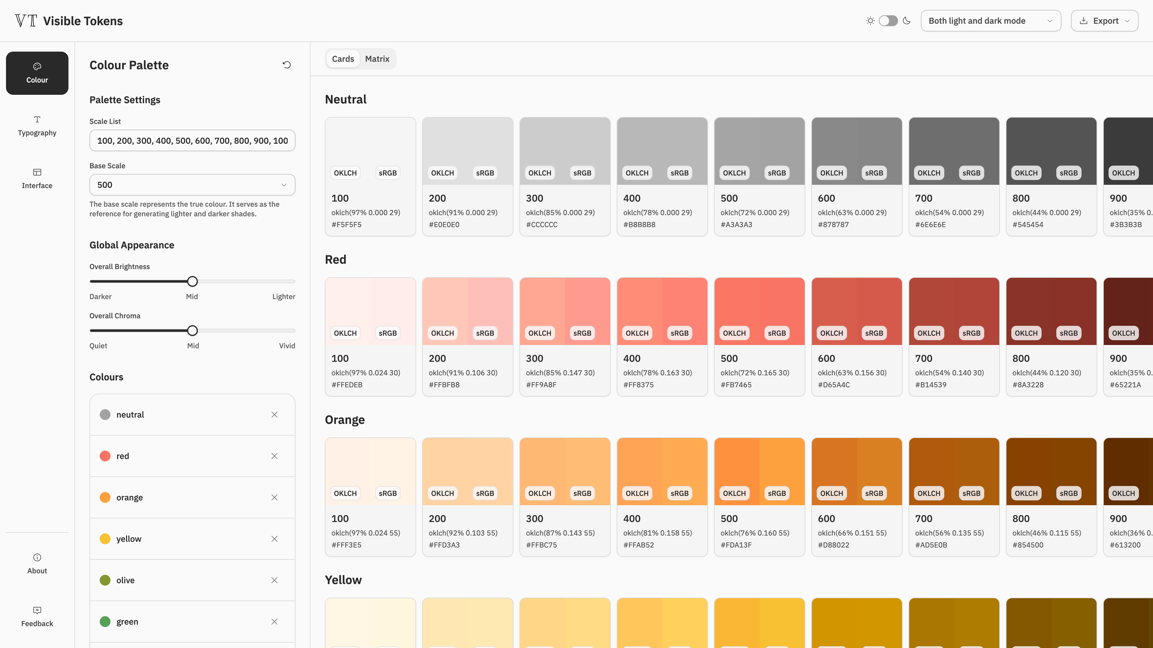
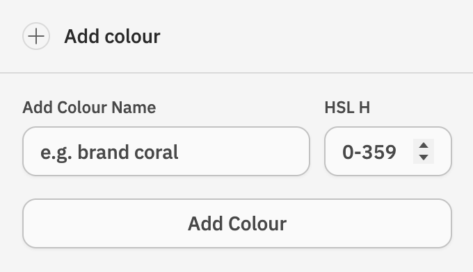
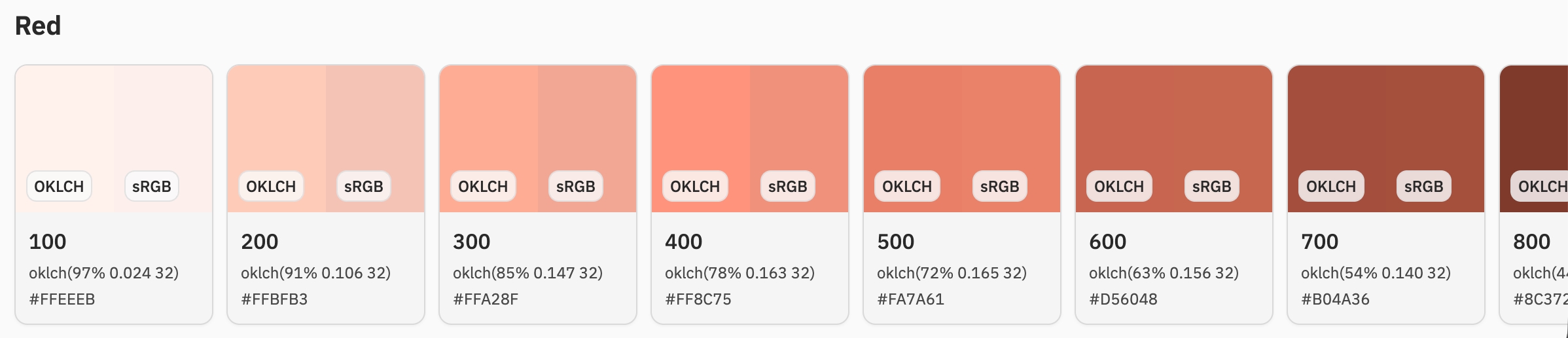
The idea is quite simple. Start with the colour you have in mind — for example, a warm, tomato-like red might be around Hue 10. Set the hue to 10, and VT takes it from there, generating the full scale of reds automatically.

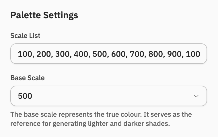
Palette settings
The palette scale is completely flexible. It can be 100–1000, 100–500, or even 100–2000 — whatever works for the system. Normally, a value somewhere in the middle is used as the base scale, but it doesn’t have to be. It simply acts as a reference point for how many lighter and darker shades are needed on either side.
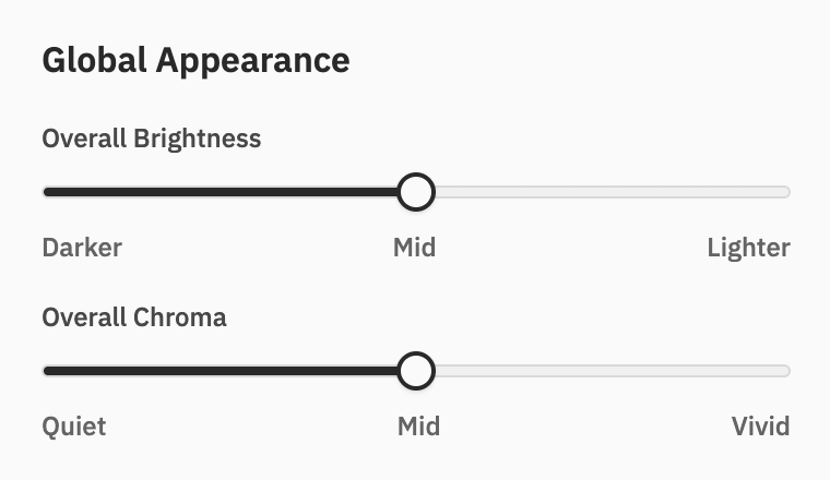
Global Appearance
Once a palette is finished, someone on the team or yourself might suddenly feel it looks a bit too faded. Normally, that means going back and adjusting the colours one by one. The global sliders are made to avoid this nightmare — simply move the slider, and the whole palette updates together.
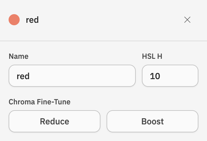
Fine-tuning some colours
Sometimes, people just want one colour to feel a little different. You might have heard this many times: “Can the red be redder?”
Don’t roll your eyes — VT can help. You can adjust one colour without messing up the rest of the palette.
Simply use the buttons to reduce or boost the chroma. VT generates a slightly more muted or vivid version of that colour while keeping its overall brightness level consistent with the rest of the scale.
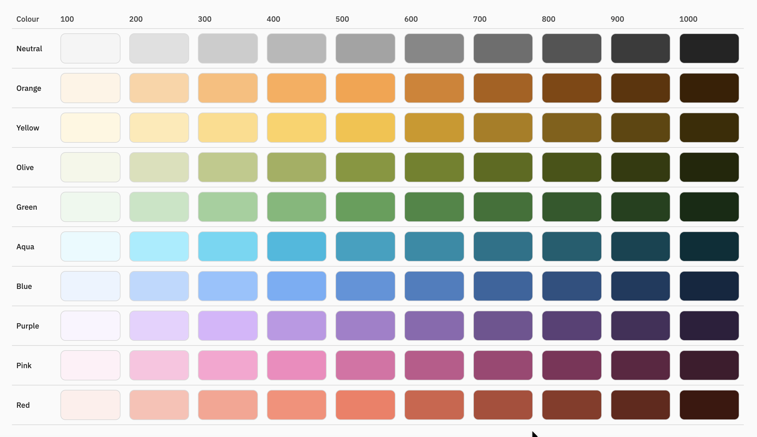
Matrix view
The Matrix View gives a better overview of the whole palette while making adjustments.
Typography
Choose fonts based on your product’s tone
Choosing fonts usually means scrolling through a long list in Google Fonts or Figma, trying different options, and then figuring out which title and body fonts work well together.
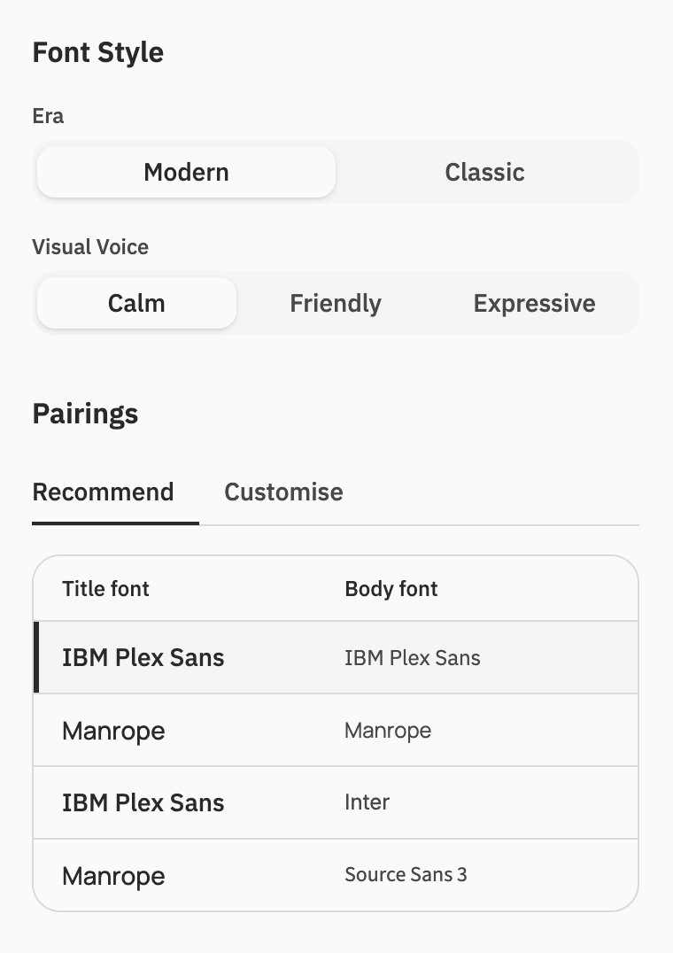
Visible Tokens takes a different approach. Instead of starting with font names, start with the style of the product. First, choose whether it feels more classic or modern, then narrow it down by personality — calm, friendly, or expressive.
From these selections, VT recommends font pairings for titles and body text that match the overall tone of the product.
Interface
A simpler way to set up neutral colours
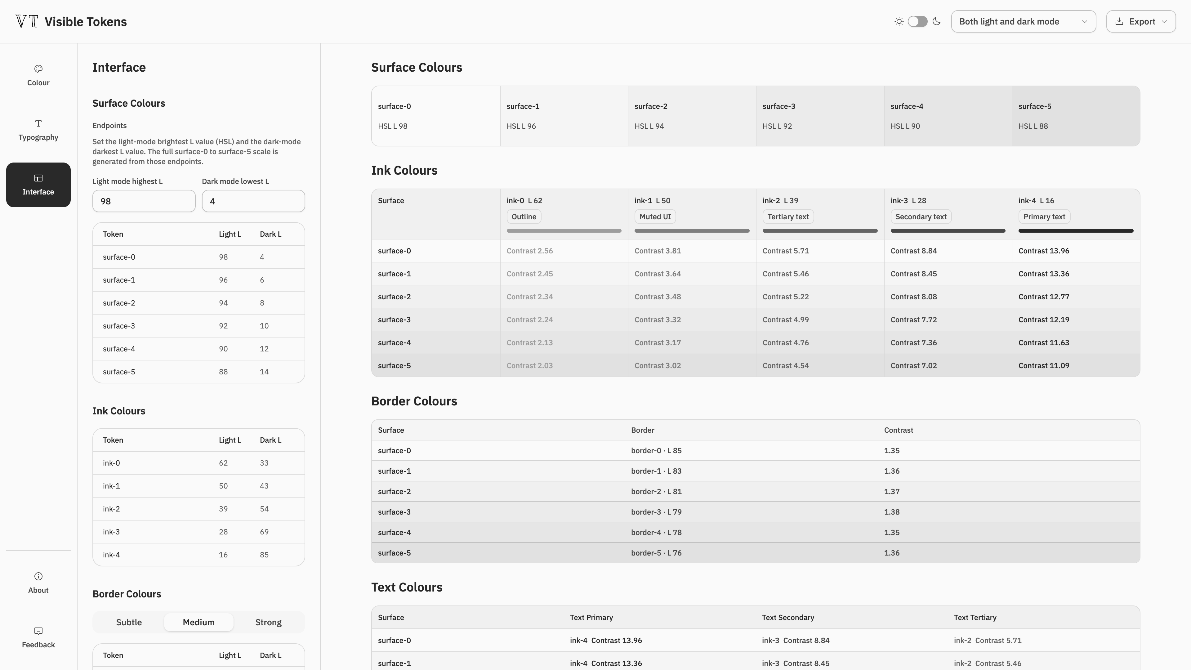
If the interface doesn’t need tinted surfaces, text, or borders — no bluish backgrounds, slightly tinted text, or colour-touched borders — and simple greys are enough, VT provides a much faster way to set them up.
Simply choose how bright the lightest surface should be, and VT generates a set of progressively darker surface colours to use across the interface. For dark mode, it works the other way around.
For each surface, VT also generates a matching border colour and three levels of text colours, with proper contrast ratios and enough brightness difference between them to create a clear visual hierarchy.
This makes it much easier to create colours that need to work with and constrain each other, rather than choosing every value separately and repeatedly checking whether they work together.
P.S. Instead of using the exact same border colour across the whole product, VT generates a border colour for each surface. The idea is to make borders look visually consistent across different backgrounds, rather than simply keeping their colour values consistent. Of course, this depends on the design approach you prefer.
Responsive
Light/Dark mode switch
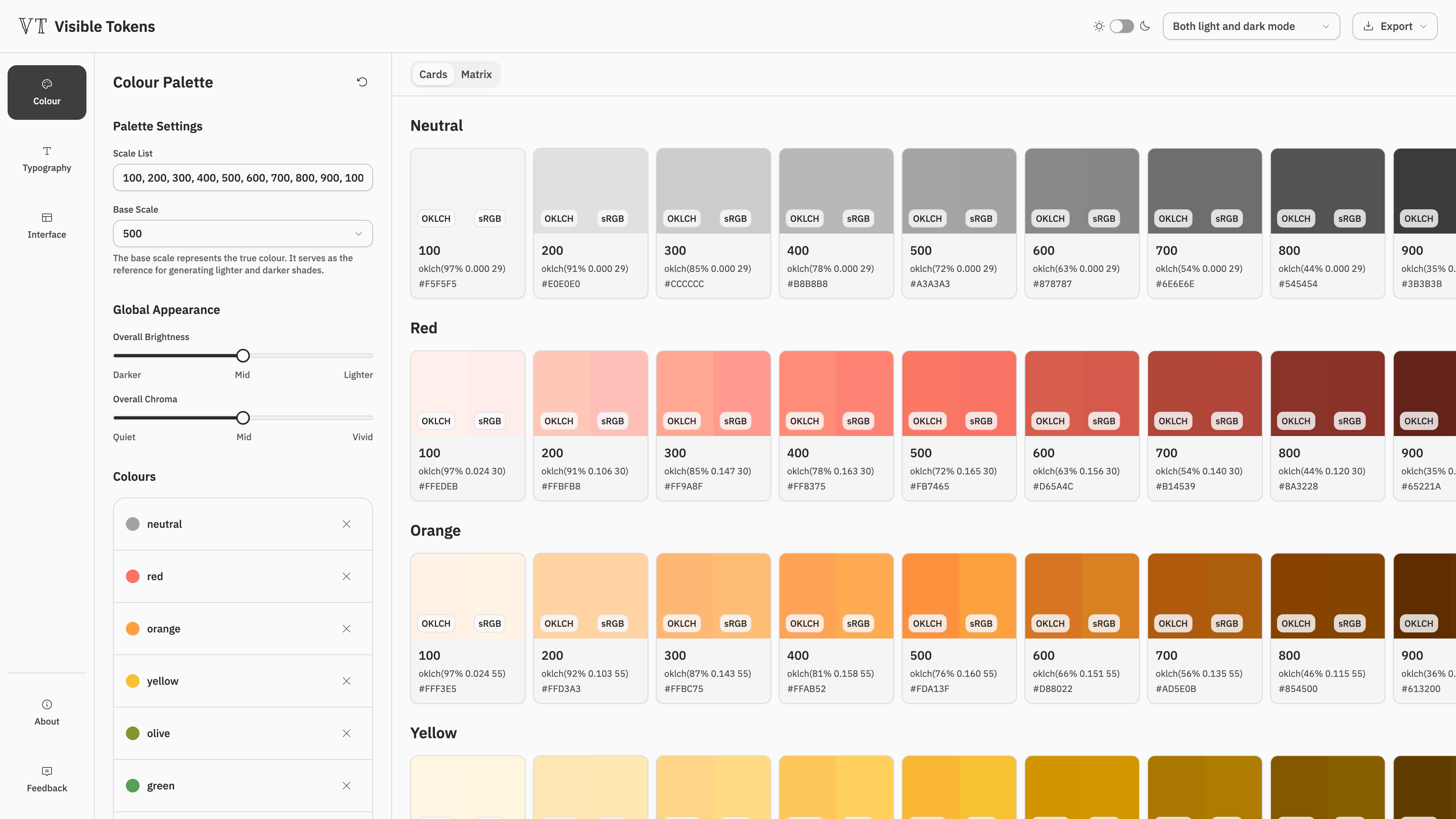
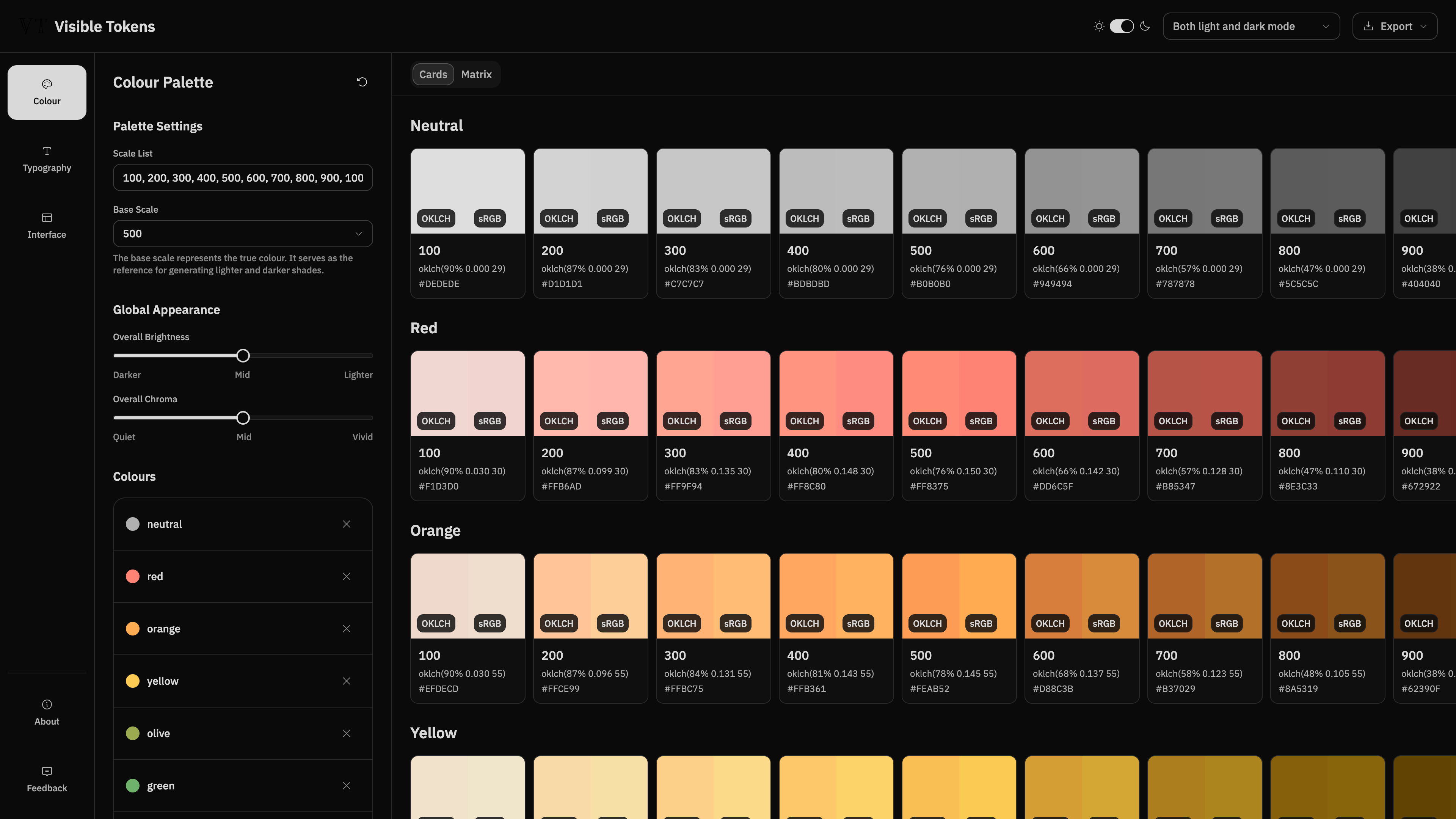
VT visualise all your settings in both light and dark mode, you see what you select.
Additional Help
Every setting can be previewed directly on the website. Fonts update as you make your selections, along with surface, text and border colours, spacing, and radius — so you can see how everything actually works together.
The idea is simple: don’t just set the tokens, make them Visible.
Figma Plugin
Turn all those settings into something usable
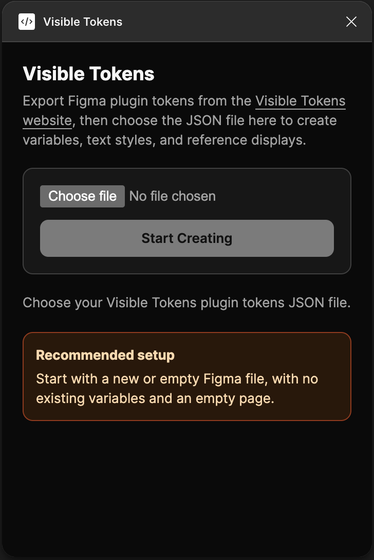
Once all the settings are finished on the website, export the file and import it into the Visible Tokens Figma plugin. In less than a minute, the plugin turns everything into Figma variables, text styles, and reference frames — ready to use in the design.