Visuals
Colours
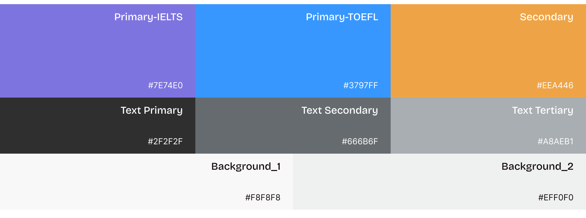
Unified colours across multiple products
Each test type keeps the same colour direction as its official test branding, but the colours are fine-tuned to work together as a family within the product. This keeps each test recognisable while giving the whole platform a more youthful, and friendly feel. Secondary colours are based on the company’s brand colour, and text and background colours are shared across all products to create a consistent visual experience.
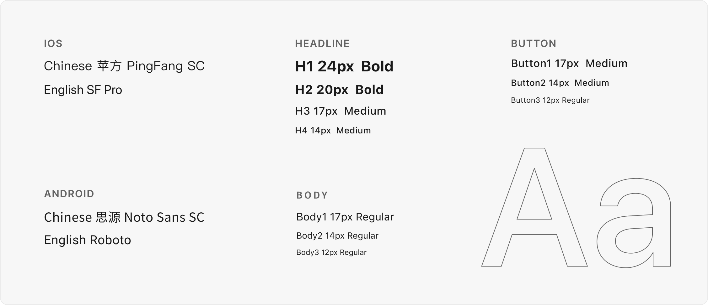
Fonts
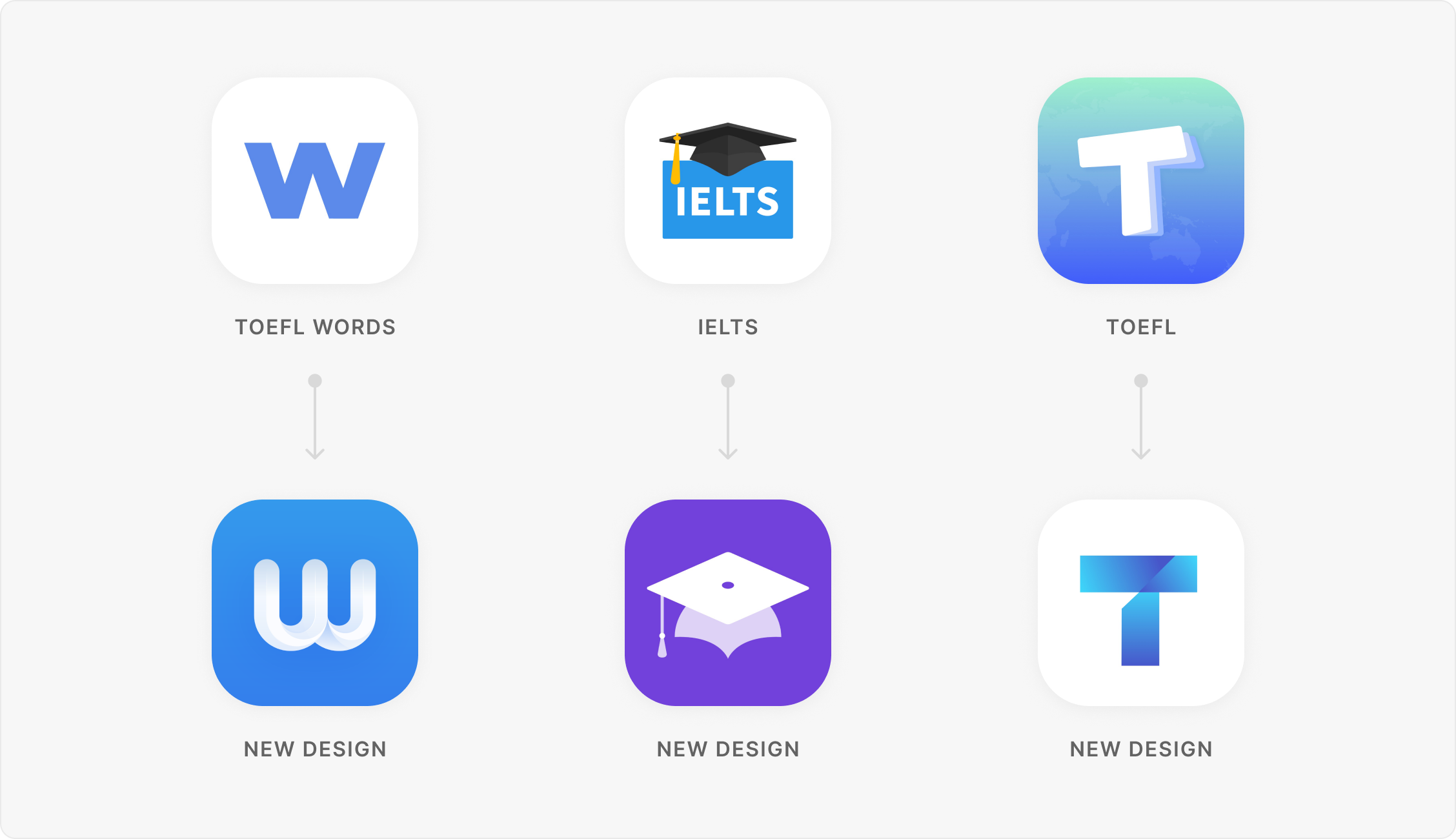
Redesign Logos
Applied the new brand colours and created a more consistent visual language across the product, with a modern and simple design style.
IELTS Redesign
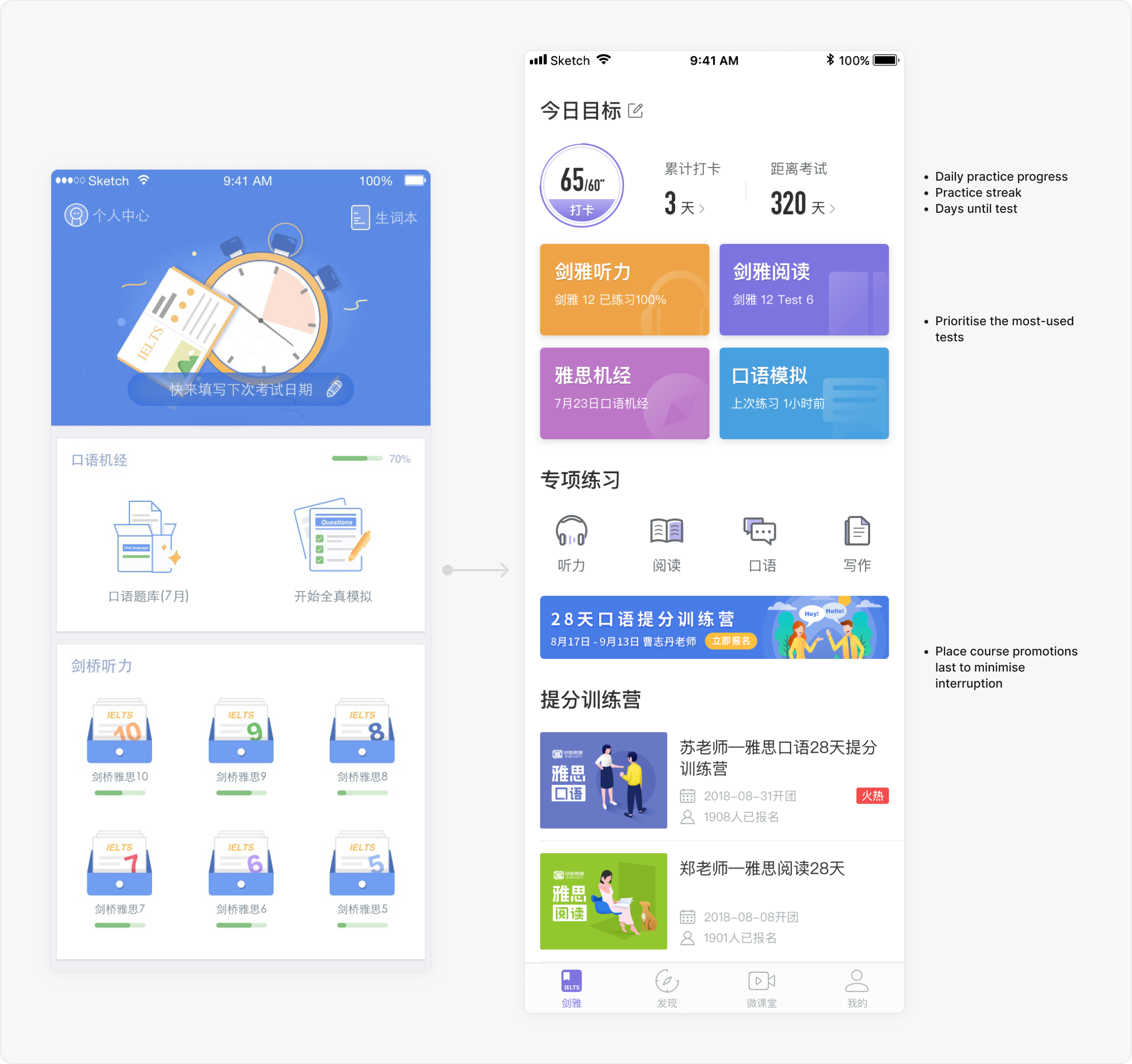
Home page redesign
Showing students their progress, days remaining, and daily completion encourages them to stay on track and achieve their daily goals. The redesign also increased overall user engagement.
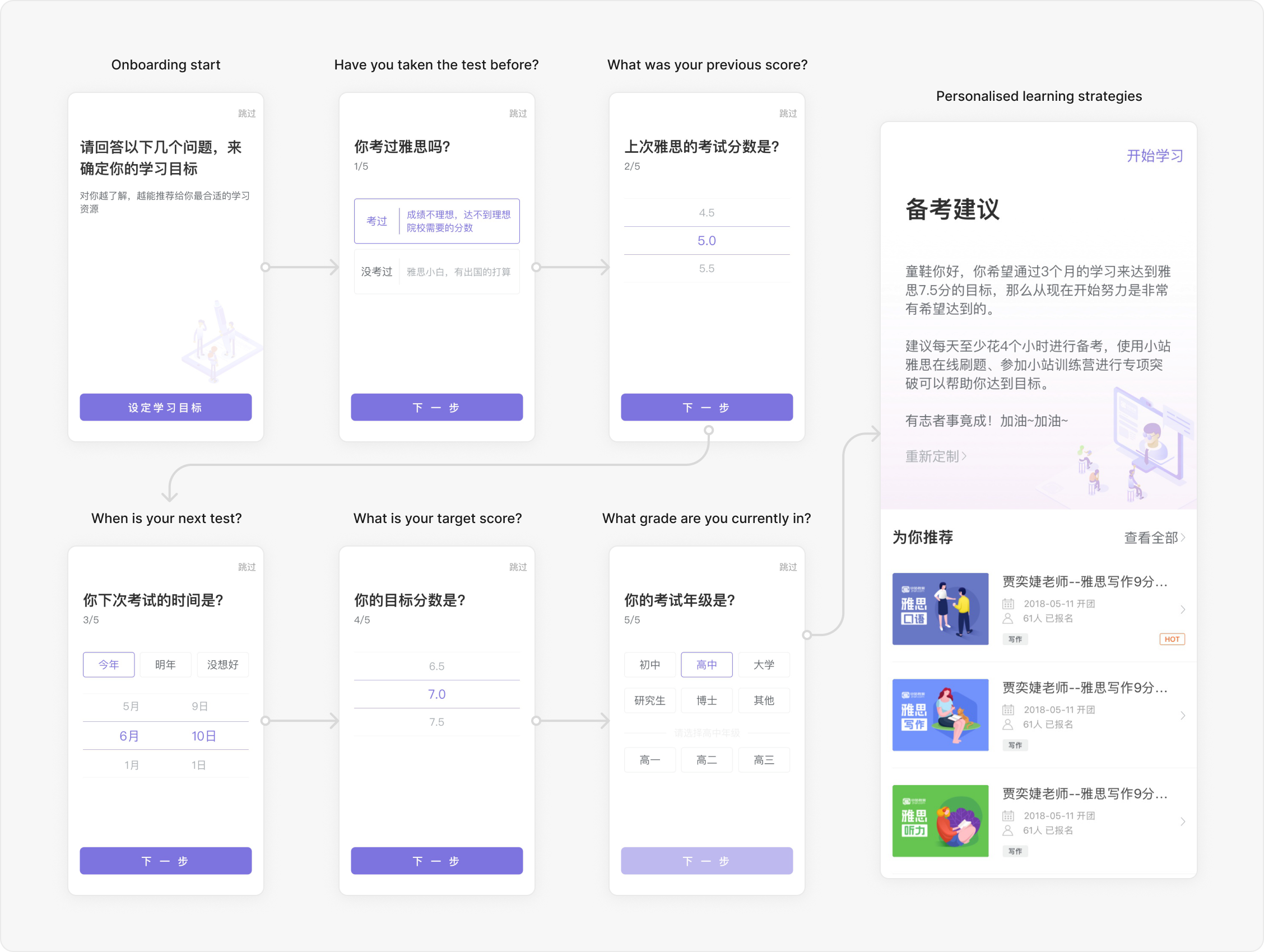
Personalise the learning journey
Use goal setting to create tailored learning plans, giving users clearer direction and encouraging ongoing engagement.
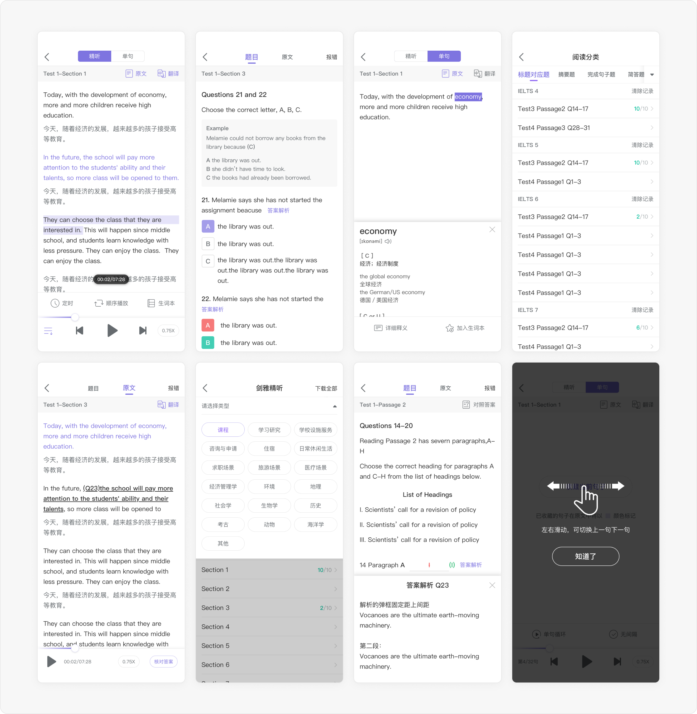
Redesigning the mock exam experience
Improve the usability and visual design of the listening and reading mock exams based on user feedback.
User Feedback
- The text colours are dull and lack contrast, making articles and quizzes difficult to read.
- Tap targets are too small and often require multiple attempts.
Marketing Design
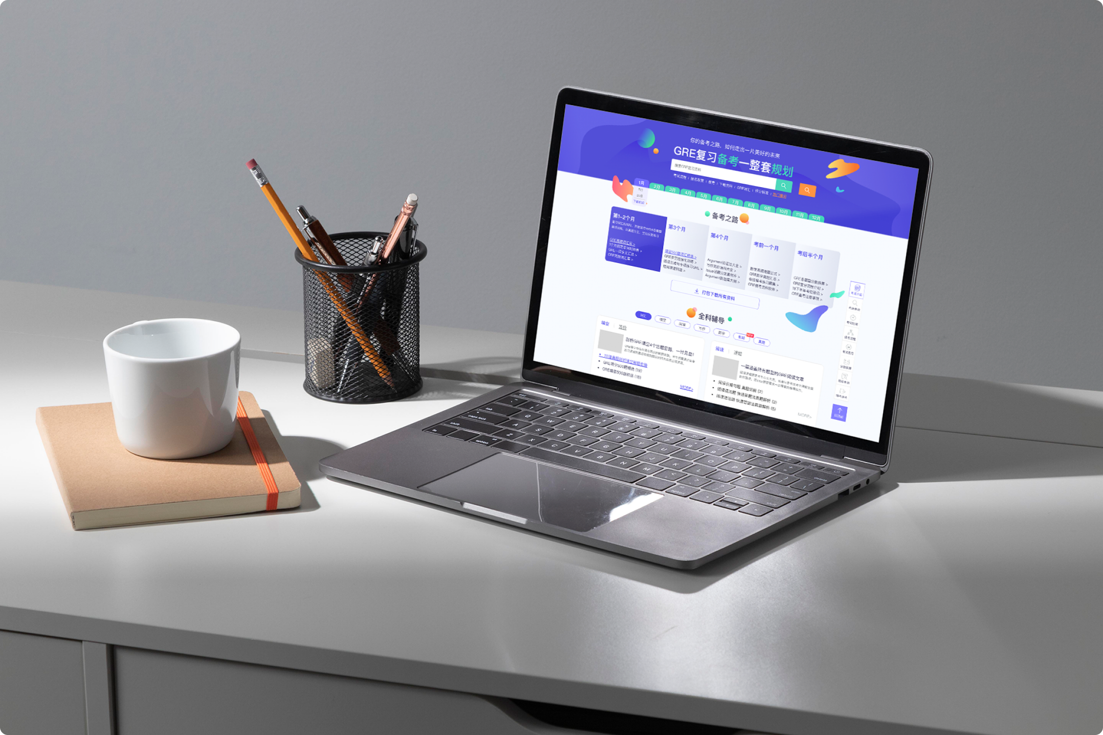
Design learning resource pages
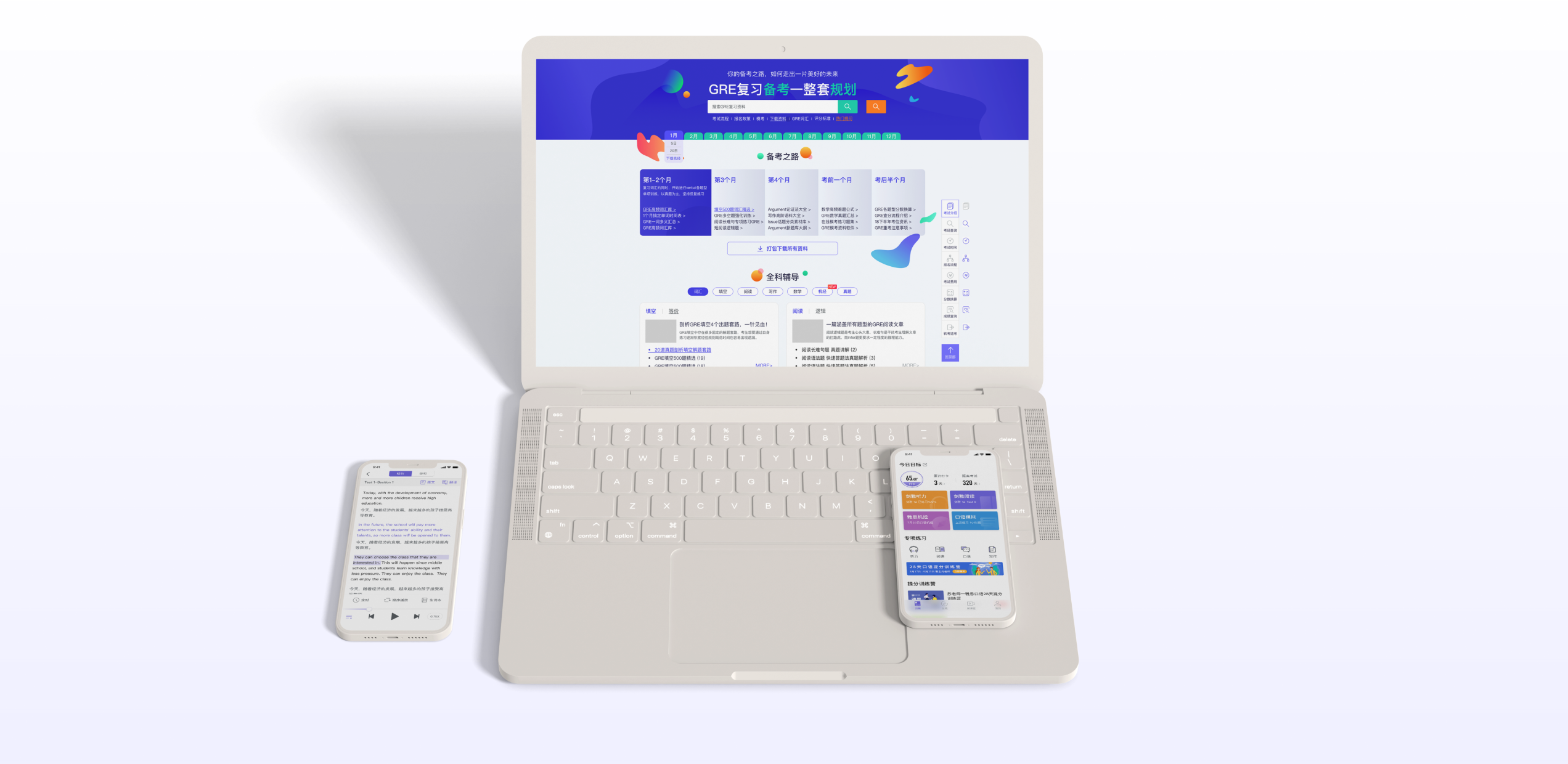
Collaborated with experienced English teachers to create dedicated learning resources, such as TOEFL speaking guides and IELTS essay samples with expert analysis, helping students learn test strategies in a more structured way.
Online course pages redesign
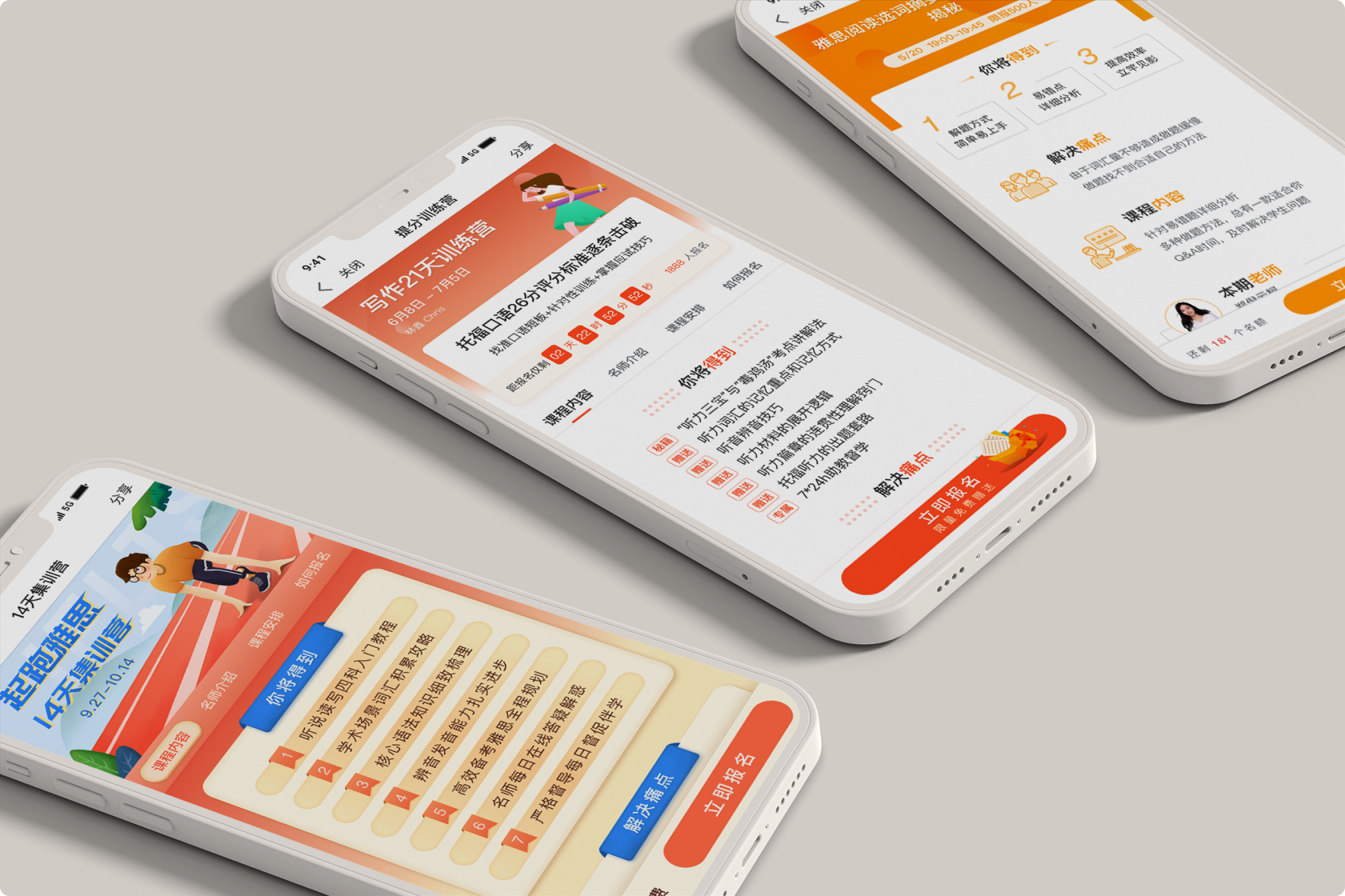
Redesigned three key course pages:
- Xiaozhan Open Class
- 21-Day Intensive Course
- 14-Day IELTS Starter Course
Refined the content and redesigned the information hierarchy to clearly communicate each course’s value, highlight key benefits, and encourage course enrolment.